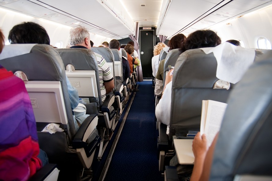
I was living part of my life in “Southwest airlines flights” for the past 8 months (almost 30 days was in a flight) and this is something I noticed on my travel as a usability guy working for Apptivo which I felt worth sharing.
Since I am always curious about the visitor’s behavior I started thinking of this craft as a website (and as a business) and how people are behaving inside and I was surprised to see most the time the people who are traveling read the messages and decided what to do and everything goes well perfect.
I decided to count the number of message posted in the craft for the travelers to read and make their decision quick and easy with no irritation or panic.
From the spot I sat I decided to count the number of “Messages” posted to visitors which was visible to my eye. Excluding the seat numbers above each row, there were 23 messages posted around me of different information’s communicating to the travelers.
How did they design these messages and place it well enough so it doesn’t become an irritant to the traveler? Amazing work…
Point to be noted-
- Messaging is important
- How it is messaged is also very important.
- Too fewer messages will make the user feel blind.
- Too many visible messages will make the user feel overwhelmed and will run off.
- We in this country used to this kind of visual comfort, will we have visual irritation or go crazy when we go to other country?
23 Messages visible but still not irritating the traveler’s eye on their flight travel is something amazing.

